You can find a full version of my case study on Medium. It has been featured on Sidebar, UXDesign.cc, casestudy.club, and a couple of other UX design blogs.
Zara is one of my favorite clothing brands, but I run into problems every time I use the app. Although I am not affiliated with Zara in any way, I wanted to figure out if other users were having similar problems. I conducted guerilla usability tests, discovered multiple areas that could be improved, and ended up redesigning part of the shopping-cart experience.
The first step I took was perform online research around Zara's customer-base. I then created a couple of provisional personas to cover the hypothesized, largest group of customers: professionals in their 20s and 30s and in the middle-upper income bracket.
Given more time, I would validate the personas I created via user interviews.
In addition to personas, I also spent some time understanding the context surrounding the users when they use the app in order to further understand their motivation and desired outcome.
With a better understanding of the user, I went to a mall with a Zara store and selected mall-goers to perform guerilla usability testing. I sampled people to test and validated that they were at least frequent online shoppers prior to beginning the testing. I ended up testing seven users.
Each user was asked to imagine he or she was in a scenario and to perform a series of tasks such as:
I reviewed recordings of the testing-sessions carefully and laid out the problems and complaints that each users had. I then used affinity mapping to organize and group these pain-points into categories.
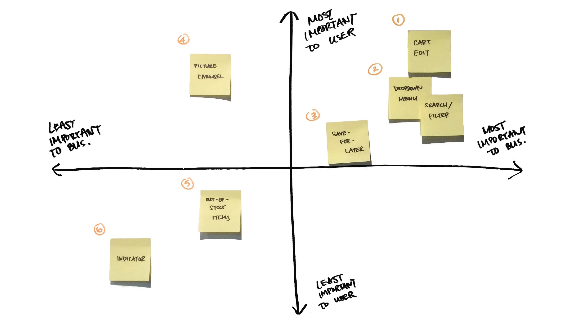
To help prioritize the issues, I used a 2x2 map to help rank the category of issues by how important they are to the business (x-axis) and to the users (y-axis). Assuming that the main business goal for the app is to drive up mobile revenue, I decided that the pain-points around editing cart-items were the most important to the business and users. Thus, those were the issues I scoped into my redesign.

I closely analyzed users' behavior and patterns related to the shopping cart in order to come up with solutions.

When trying to edit an item in the cart:
Other issues:
After reviewing the issues surrounding the shopping cart edit flow, I mapped potential solutions to each of the pain-points and created rough UI sketches to encapsulate the solutions.

Before diving directly into prototyping my design, I performed preliminary validation by walking through the Lo-Fi UI sketches with a few more online-shoppers. I received some good insight and incorporated them into the final design.
Please see my proposed solutions below:
* - The new ‘edit’ button replaces the old ‘buy later’ button; however, this was an intentional choice. Previously, when users wanted to save an item for later, they could only do so when an item is in the shopping-cart. I would add the ‘save-for-later’ function to the product-browsing flow so that users wouldn’t have to move an item into the cart before bookmarking.
** - A vertical image carousel is consistent with the interaction pattern found in the rest of the app. During initial usability testing, users were often prone to swipe horizontally for more pictures of the item. As such, I added more prominent indicators to guide the appropriate interaction.
Ready to check out an excerpt of my prototype?
First, imagine you finished shopping on the Zara app and are ready to check-out. However, you want to edit some of the items in the cart before doing so.
Now try to do that on my prototype!
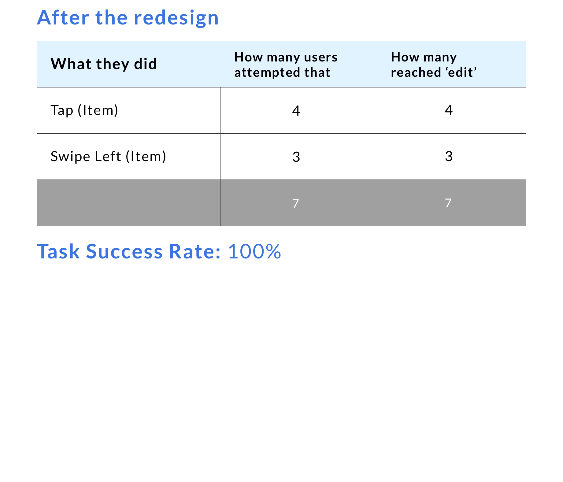
I validated my design by testing 7 users with my working prototype. The 7 users were asked to walk through how they would edit quantity and size of items in their shopping-cart. All of the users were able to complete the tasks without any pain-points.
As a result of the re-design, task success rate when a user is looking to edit an item in the shopping cart increased from 33% to 100%.
When users wanted to edit an item in the shopping-cart:


Through guerilla usability tests, I found that users were having trouble with editing items after they’ve been added to the shopping cart. My design improves the check-out process by making it easy for users to compare and edit items within their cart. Enhancing the user experience for this process means lowering customer friction, which in turn should drive more sales.